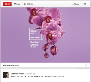
 Each year, Pantone selects a color of the year. The company just announced the 2014 Color of the Year is PANTONE® 18-3224 Radiant Orchid. This beautiful purple hue presents a great opportunity for the epilepsy community. According to Leatrice Eiseman, executive director of the Pantone Color Institute®, “An invitation to innovation, Radiant Orchid encourages expanded creativity and originality, which is increasingly valued in today’s society.”
That invitation to innovation, combined with increased resources which are being put toward epilepsy research, along with the fact that purple is the color of epilepsy awareness makes this an ideal scenario to raise the profile of epilepsy awareness in 2014.
Radiant Orchid on the Runway
This fabulous color has already hit the runways in the Spring 2014 fashion shows. You will likely see the color everywhere from Target to Bergdorf’s. As a result, you will also spot the color at the award shows, and in glitterati photos. Therefore now is the time to maximize this exposure, and align the color with epilepsy awareness.
Past colors of the year
To give you a sense of the impact this color will have, this year and in the future, here is a list of recent colors of the year:
Raising Epilepsy Awareness with Radiant Orchid
You could go out and buy something new in Radiant Orchid to raise epilepsy awareness, but there are other ways too. Here are a few suggestions:
- You could change your email signature.
- You could change the color of your twitter background.
- You could do a blog post.
- You could tell a few friends.
- You could have a Radiant Orchid/Epilepsy Awareness party.
There are tons of inexpensive and fun ways to to raise epilepsy awareness with the 2014 Pantone Color of the Year: Radiant Orchid. What are your ideas? Let us know.


Leave a Reply